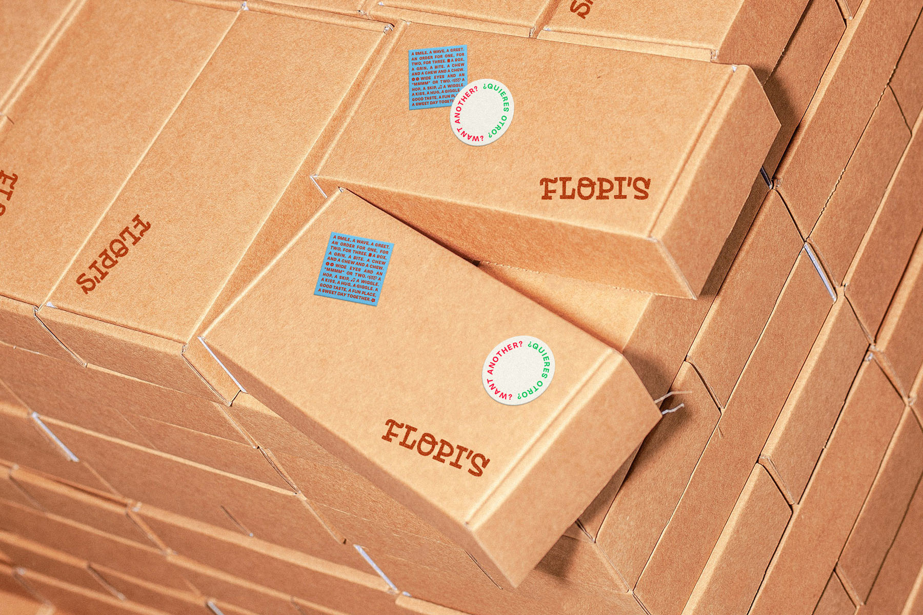
• FLOPI’S
A loving and playful doughnut shop
2024
Flopi’s is a doughnut shop coming to the vibrant surf destination of El Tunco Beach, El Salvador. Freshly made cake doughnuts plus iced coffee and limeade will be served to tourists and locals alike in the heart of the beach town.
For husband and wife owners, Flopi’s began as a call to newness, an opportunity to experiment and take risks. Repurposing a playful childhood nickname and emulating a childlike spirit, Flopi’s nods to the past, wonders at the present, and looks to the future with hope and gratitude.
ROLE — Identity Design, Custom Type, Illustration, Signage + Environmental Graphics, Packaging, Collateral
PARTNER / COLLABORATOR — Joshua Andrews
PARTNER / COLLABORATOR — Joshua Andrews
• IDENTITY CONCEPT
The story behind the Flopi’s identity system is very much inspired by the client’s values of curiosity, family, faith, and hospitality. Step by step, we follow a trail of crumbs set before us while leaving behind an impression of gratitude and joy. There are small moments and big ones; times of waiting, of activity. Twists and unexpected turns. Along the way, we’re affirmed in what we discover—and our eyes become more open to the sweetness in all of it.
The story behind the Flopi’s identity system is very much inspired by the client’s values of curiosity, family, faith, and hospitality. Step by step, we follow a trail of crumbs set before us while leaving behind an impression of gratitude and joy. There are small moments and big ones; times of waiting, of activity. Twists and unexpected turns. Along the way, we’re affirmed in what we discover—and our eyes become more open to the sweetness in all of it.


• CORE DESIGN ELEMENTS
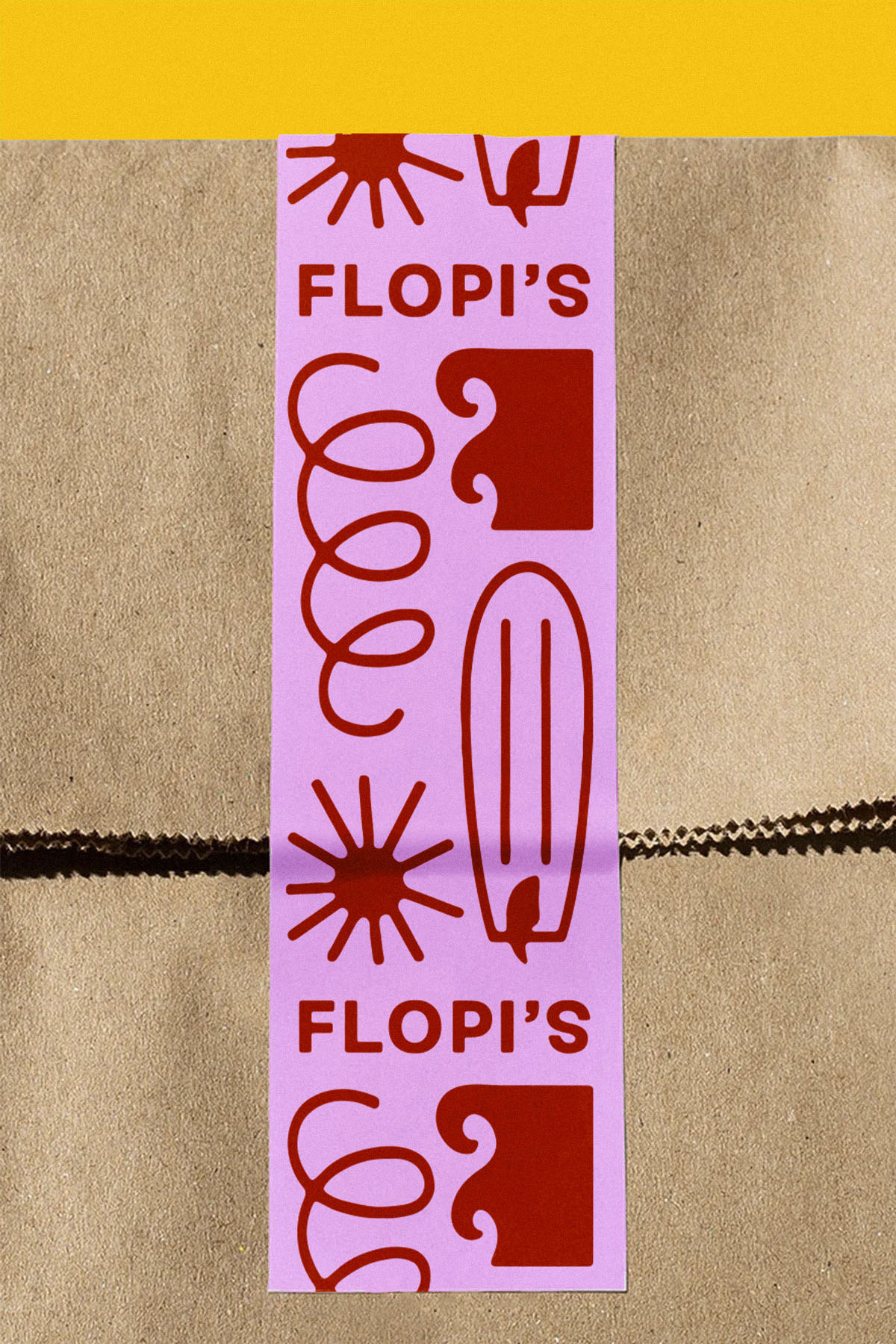
The identity system has a few signature design elements that bring the concept to life. The Flopi’s logotype has a playful, rhythmic presence featuring custom-drawn letterforms that stand with character.
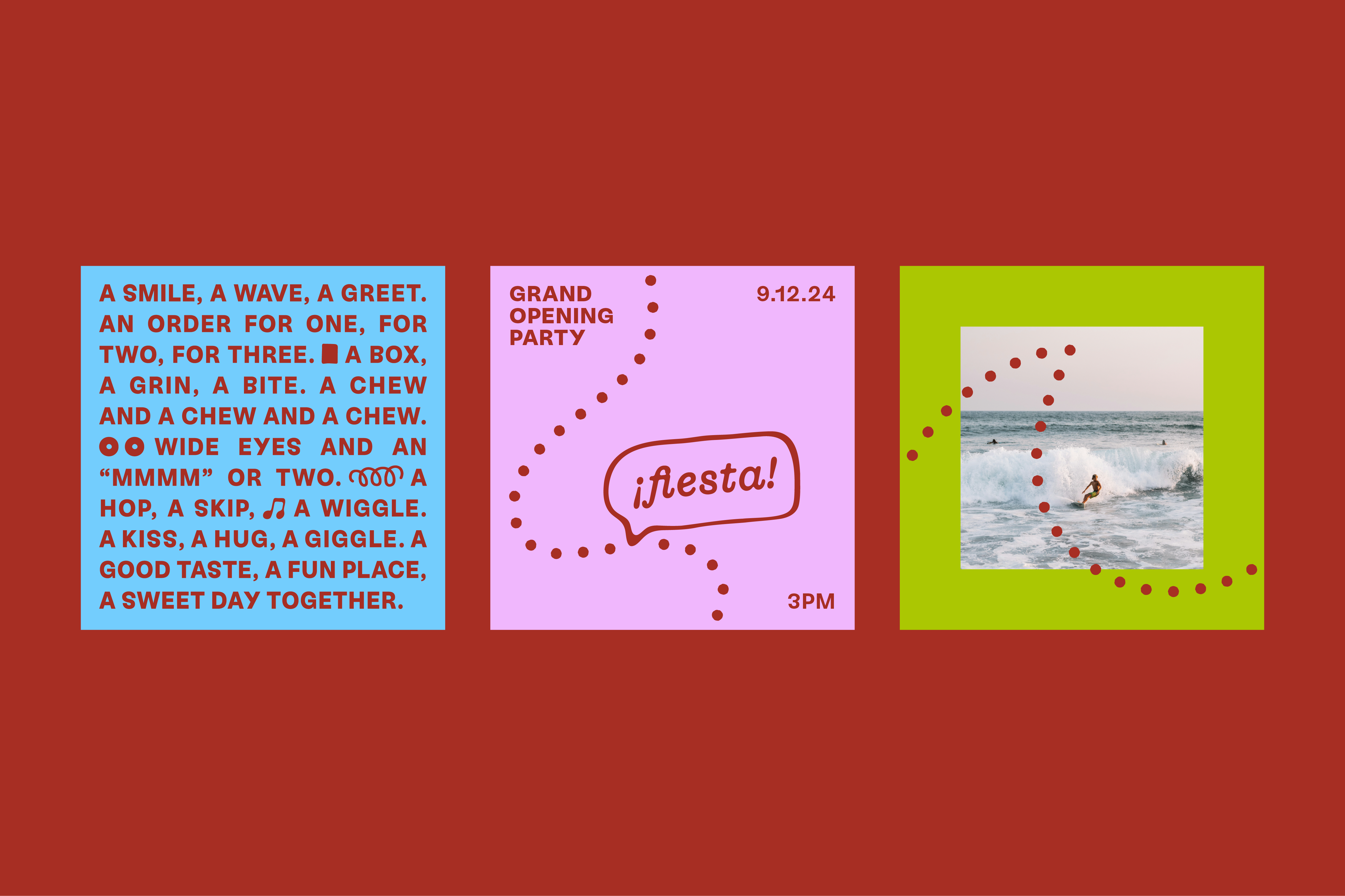
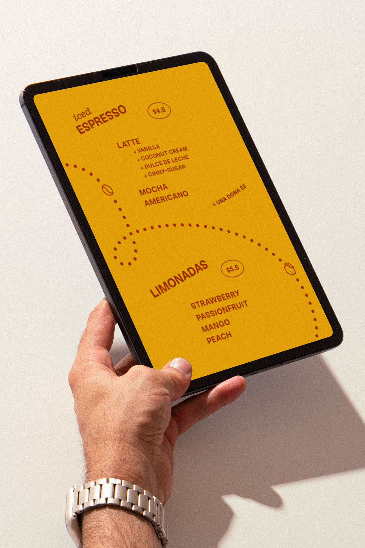
To illustrate the idea of discovery and spark curiosity among guests, trails of doughtnut crumbs flow across surfaces of collateral, revealing illustrations and messages along the paths.
The identity system has a few signature design elements that bring the concept to life. The Flopi’s logotype has a playful, rhythmic presence featuring custom-drawn letterforms that stand with character.
To illustrate the idea of discovery and spark curiosity among guests, trails of doughtnut crumbs flow across surfaces of collateral, revealing illustrations and messages along the paths.
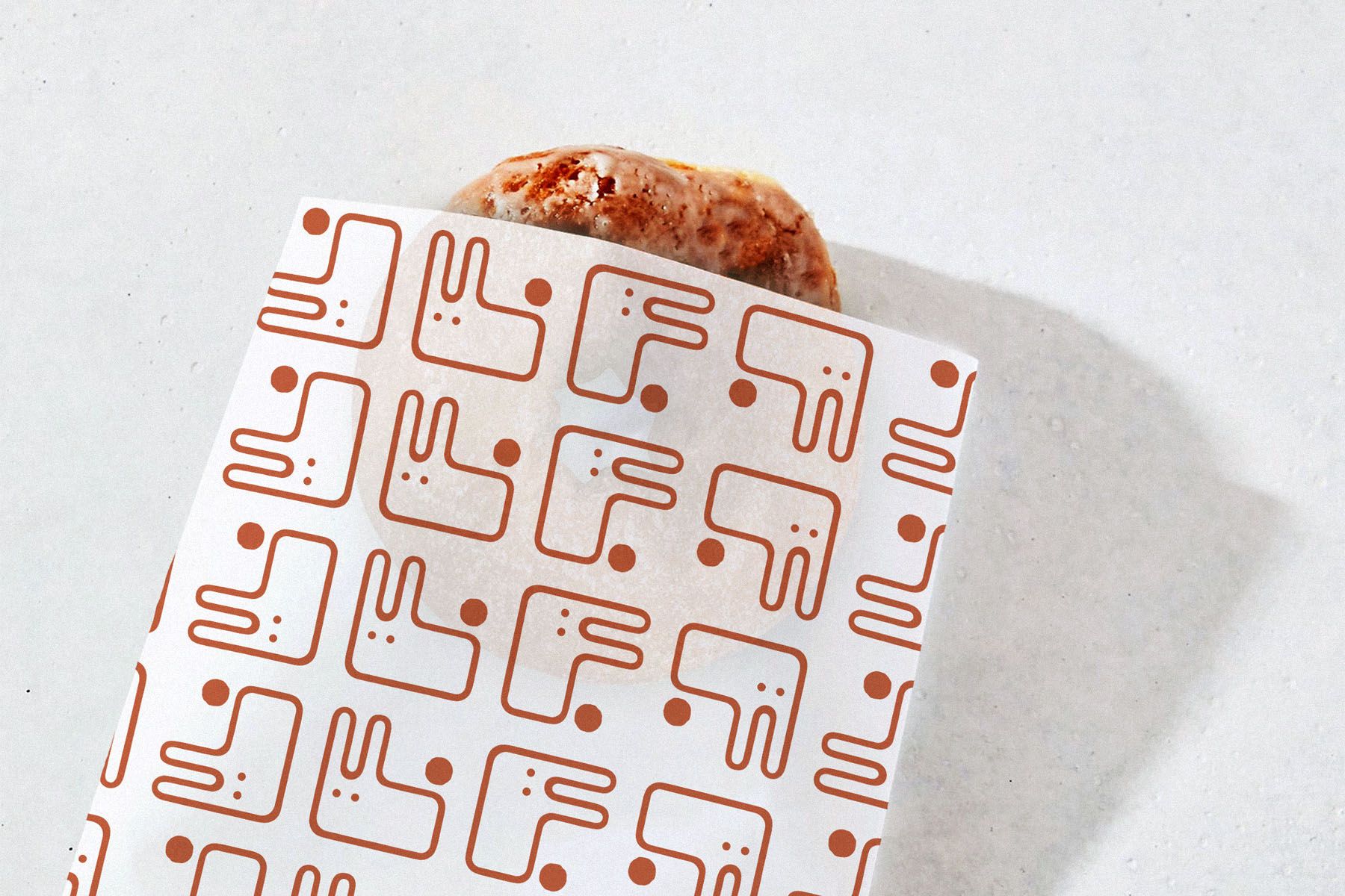
• THE FLOPI’S MARK
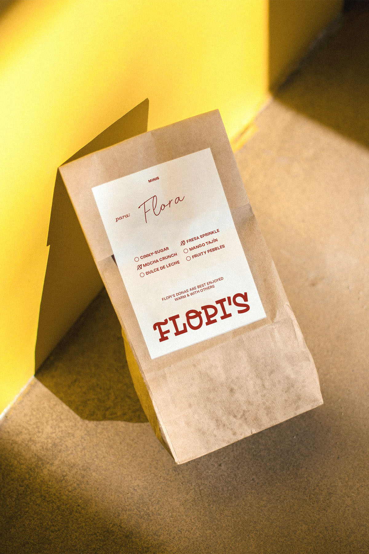
As a nod to the owner’s childhood, an “F” monogram is transformed into a fluffy bunny character.
As a nod to the owner’s childhood, an “F” monogram is transformed into a fluffy bunny character.

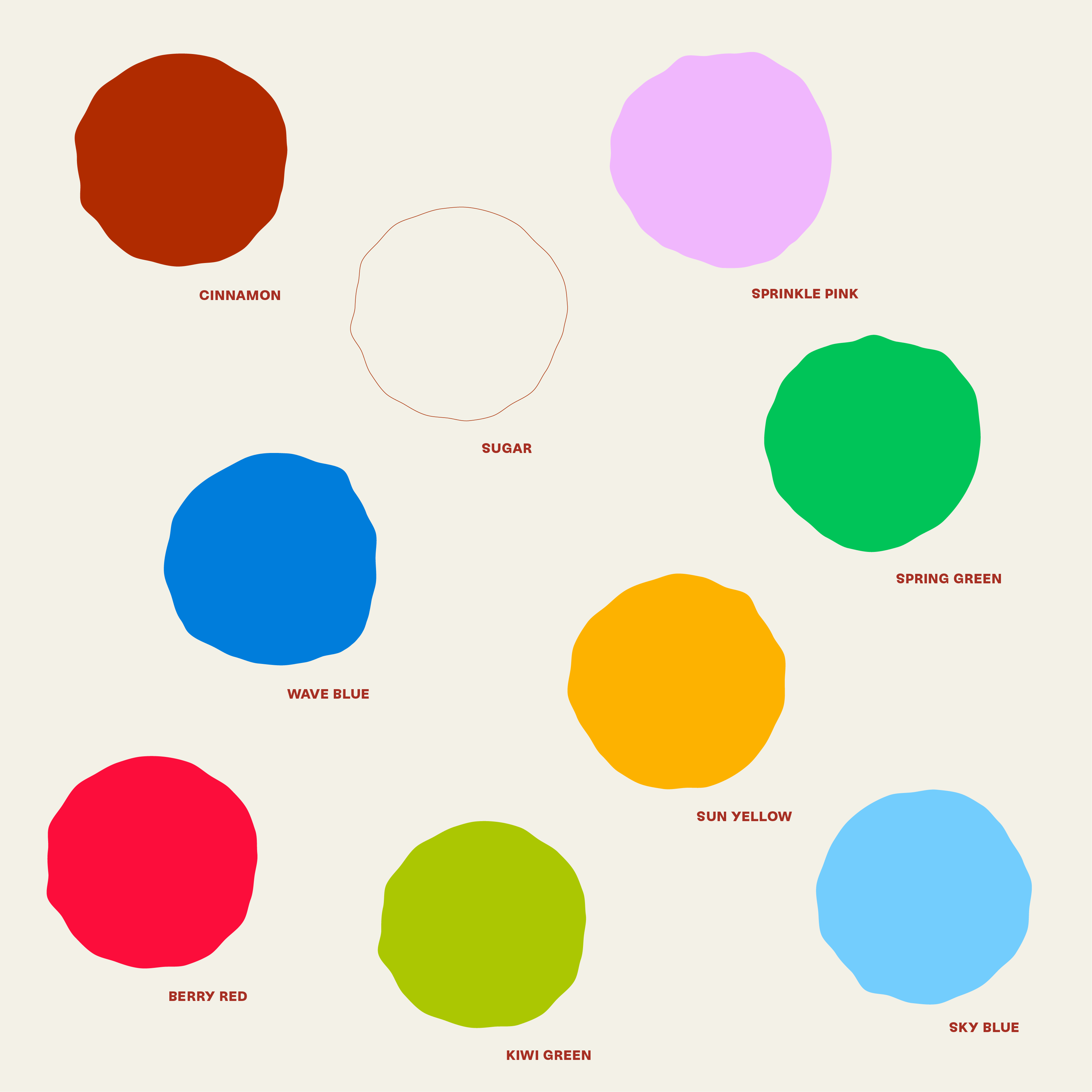
• COLOR + TYPOGRAPHY
The Flopi’s color palette leads with notes of cinnamon and sugar, tying to the primary doughnut offering. Accent colors are bright and youthful, yet thoughfully applied to elevate the brand. For Flopi’s, it was important to create distinction through color.
The type system uses a readable sans paired with a playful slab, set at angles and alternating alignments, conveying the twists and unexpected turns of the journey.

• ILLUSTRATION
The Flopi’s illustration style matches the tumbled quality of the logotype. Corners are rounded, edges are a little wobbly, and there’s some play with proportion. Illustrations are used along the crumb trails and within vignette-style lockups.