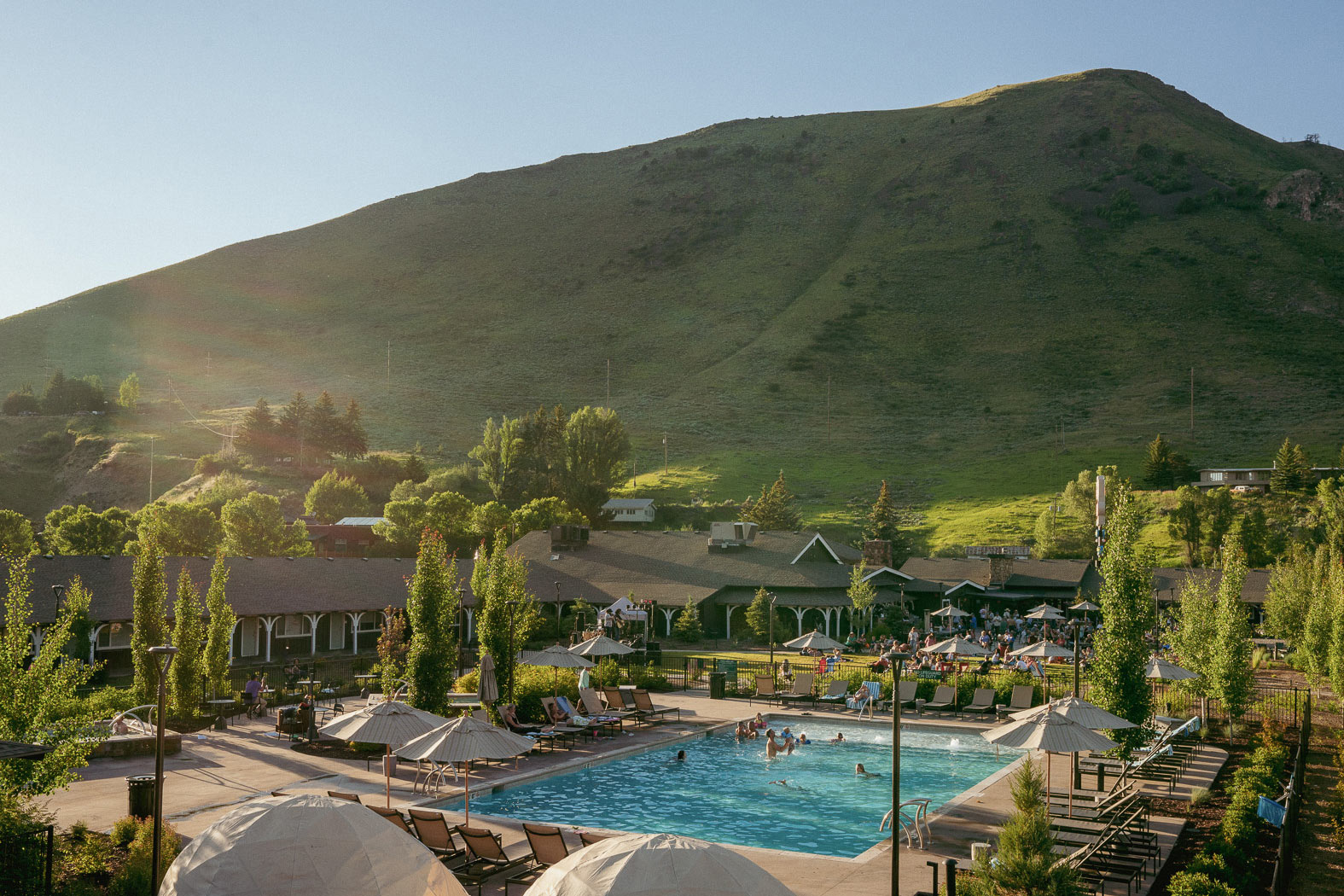
Outbound Hotels is a new collection of locally-minded lodgings in beautiful outdoor destinations, intent on capturing the unique sense of camaraderie created by shared experiences in nature. Properties provide access to skiing, swimming, hiking, biking, climbing, and more, allowing guests to dip their toes or dive right into the best outdoor recreation the environment has to offer.
Each location—with more coming soon—is positioned near a town in which guests can also immerse themselves in local culture and experience the comforts of modern amenities and touchpoints. With a heart for service and a love for the outdoors, Outbound exists to connect people to place.
ART DIRECTION + DESIGN — Simone Shafer
PHOTOGRAPHY — The Virginian Lodge, Outbound Mammoth

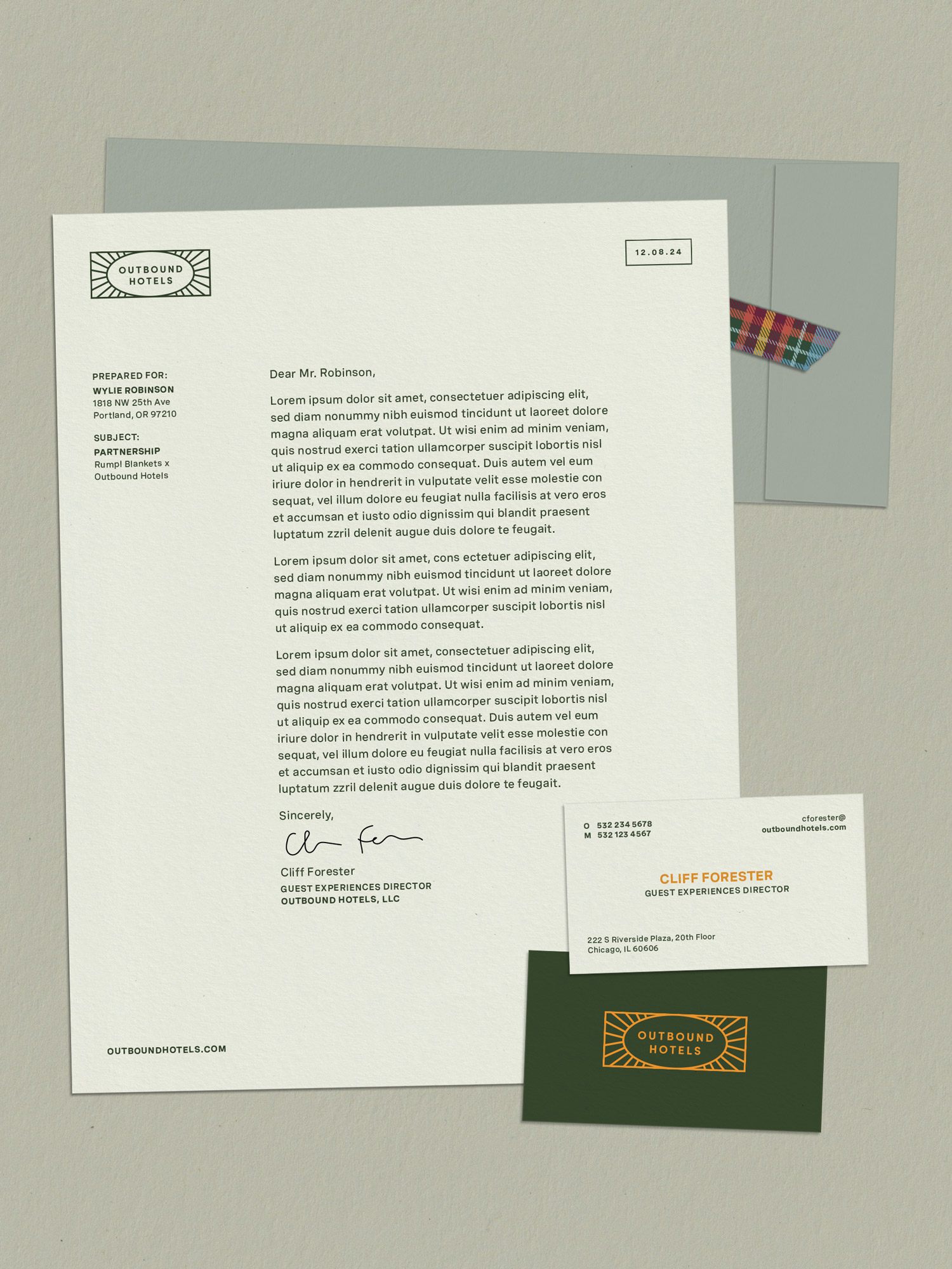
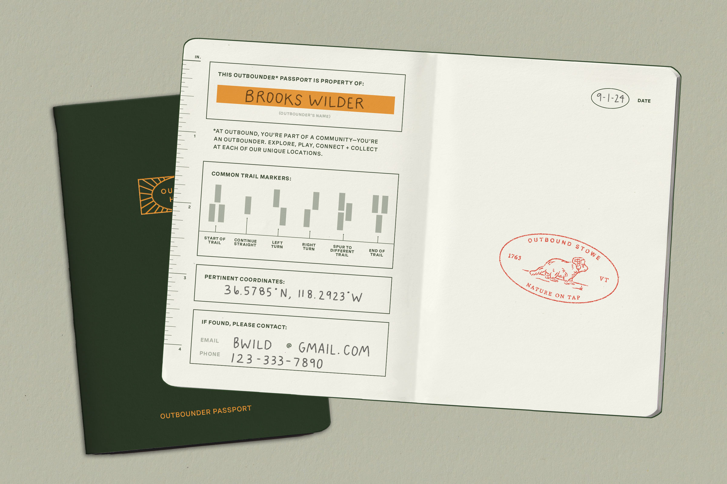
Using an existing set of logomarks and color palette, the goal was to build a robust, meaningful visual identity system appropriate for a hotel collection brand and clearly applicable to guest, owner, and operator-facing materials.
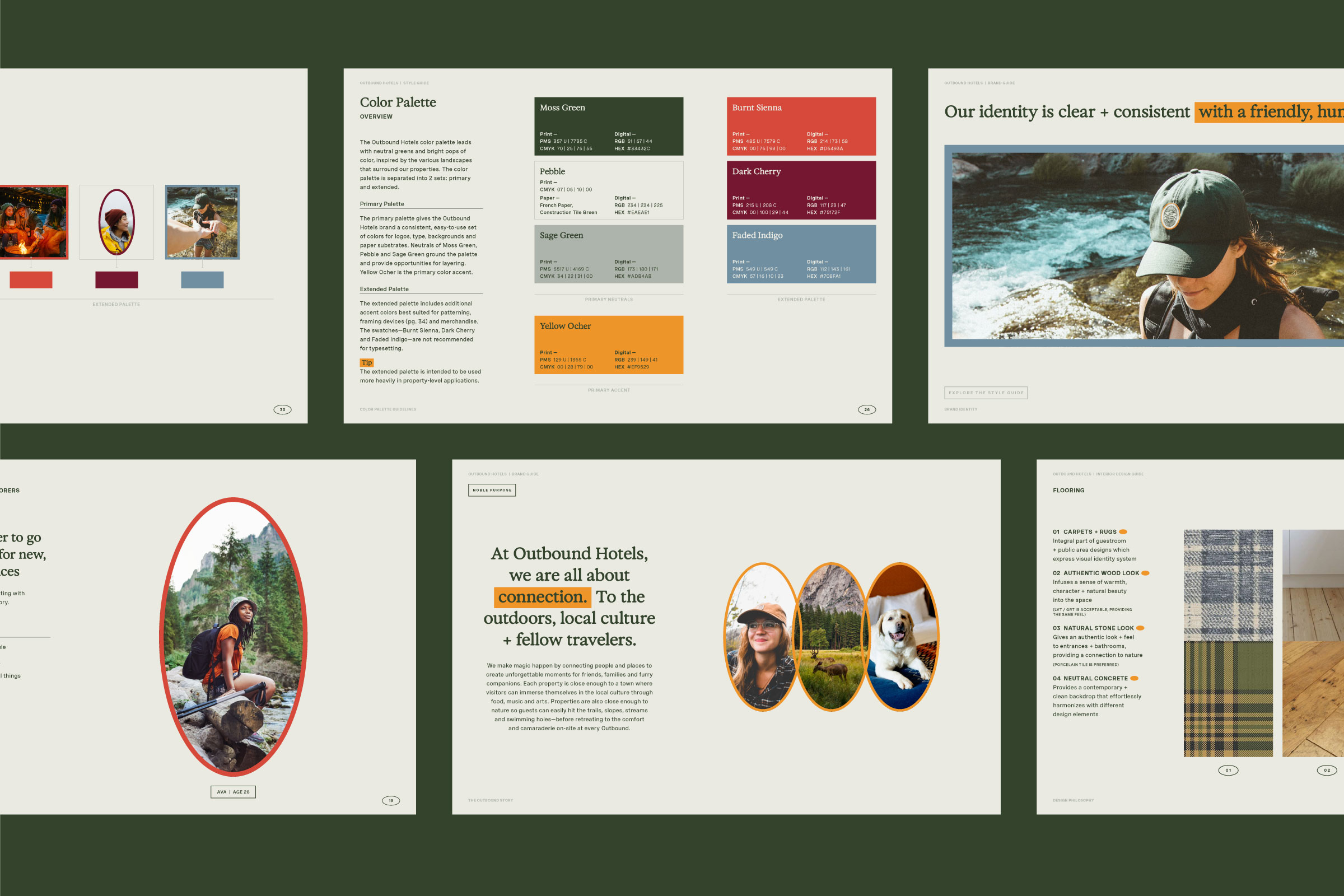
Our team exercised the use of Outbound’s existing assets to give meaning and breadth to a full set of core elements that will apply to every future hotel. Shapes are derived from the primary mark and used as framing devices, while typography balances utility and idiosyncrasy, much like outdoor trail signage. We mapped out a full set of brand identity, interior, and guest experience guidelines to help the Outbound brand navigate its ongoing growth.
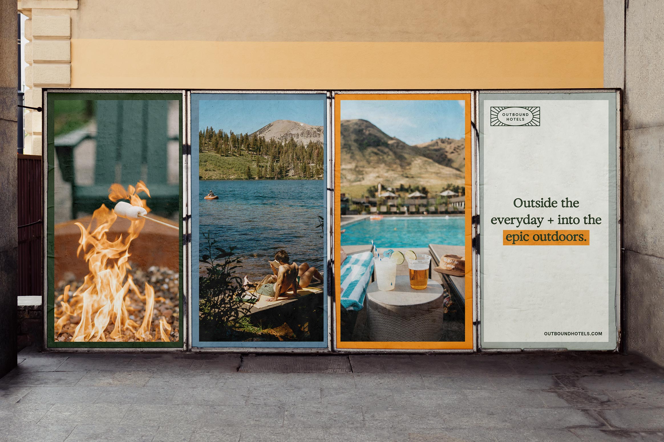

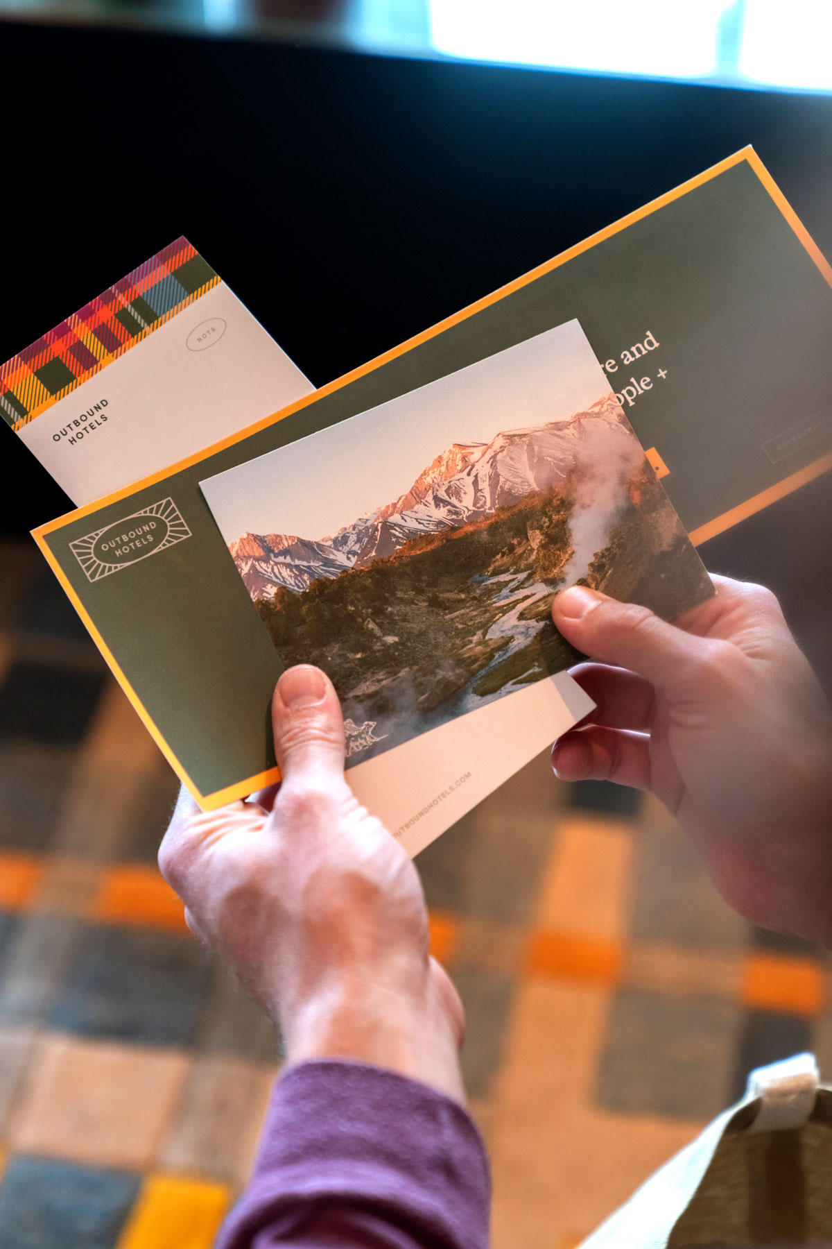
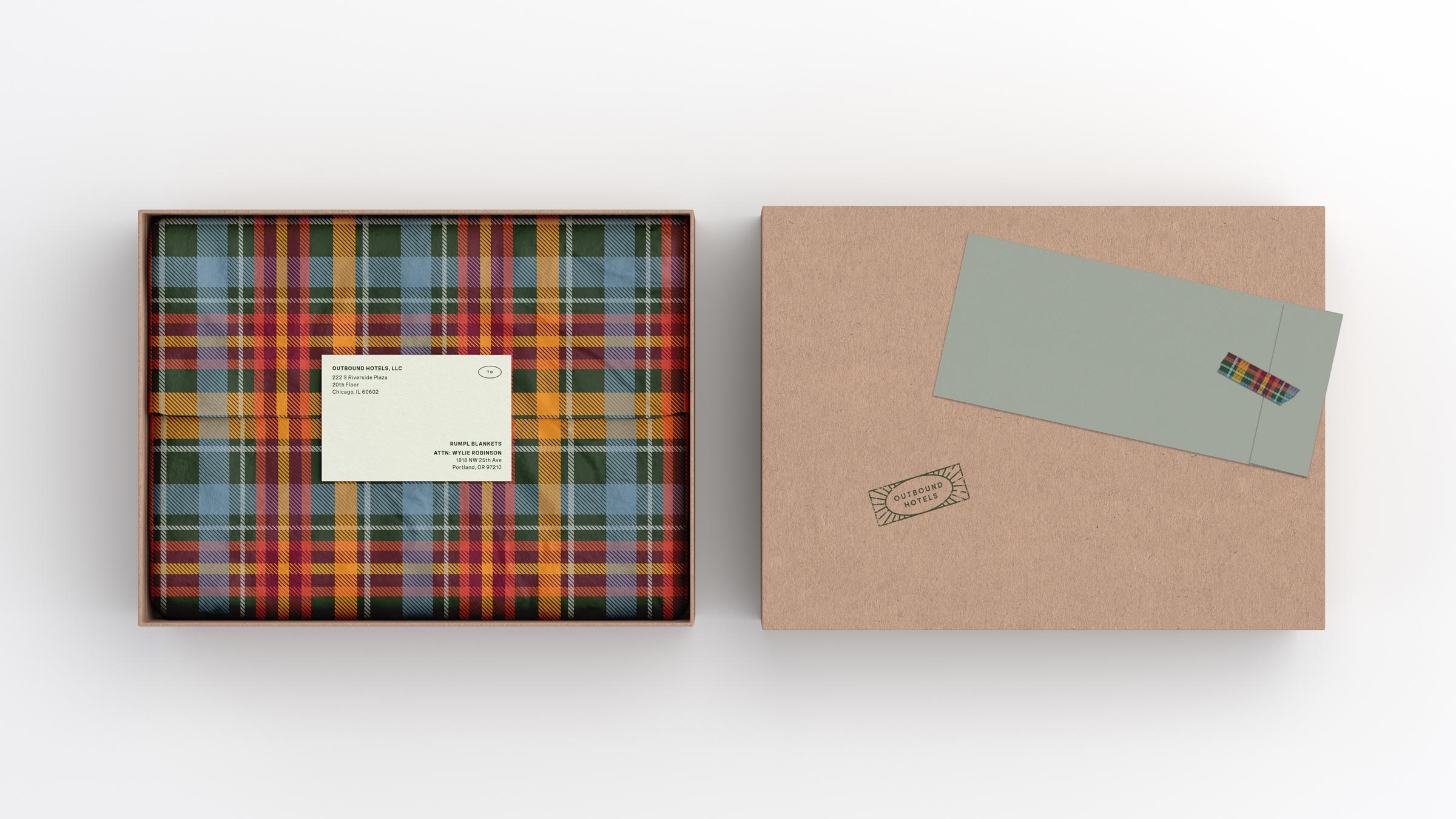
While the use of color throughout most of the identity system is thoughtfully restrained, our team created a custom tartan pattern that incorporates all colors of the Outbound palette, intended to add energy, boldness, and distinction to select print and soft goods.

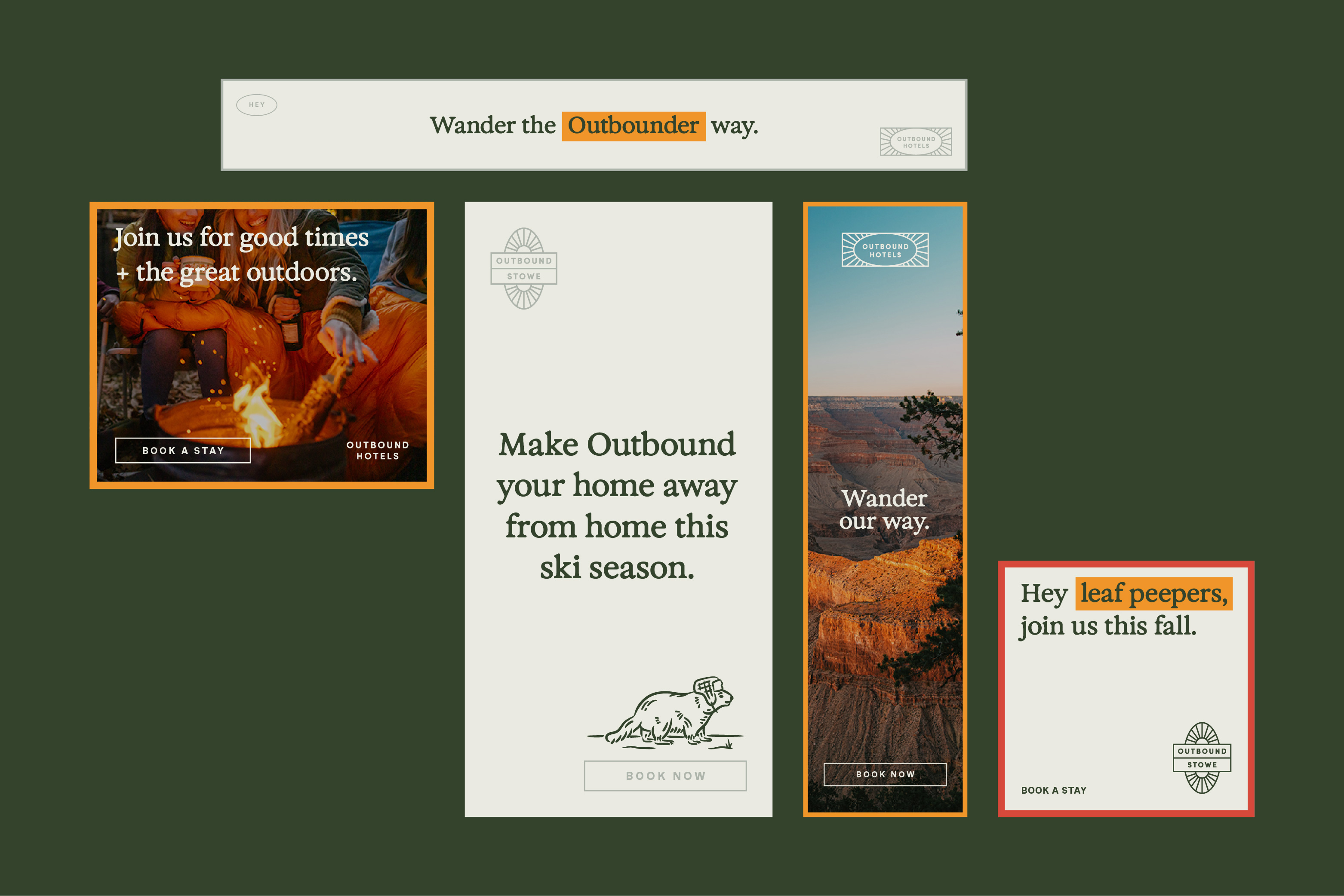
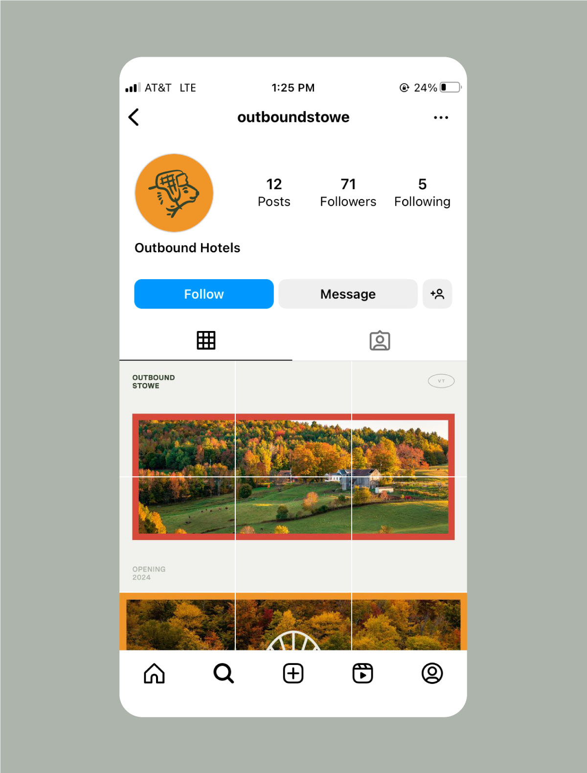
Every Outbound collection hotel’s name and logomark follow a system, creating consistency and recognition no matter the location. The property logos are designed to be flexible—easily adapted to future locations—and derived from the Outbound Hotels primary logo.
To give each hotel a sense of place, we defined a set of property-specific brand elements to layer onto Outbound’s core visual identity system. These include a property mascot, tagline, and custom oil painting.


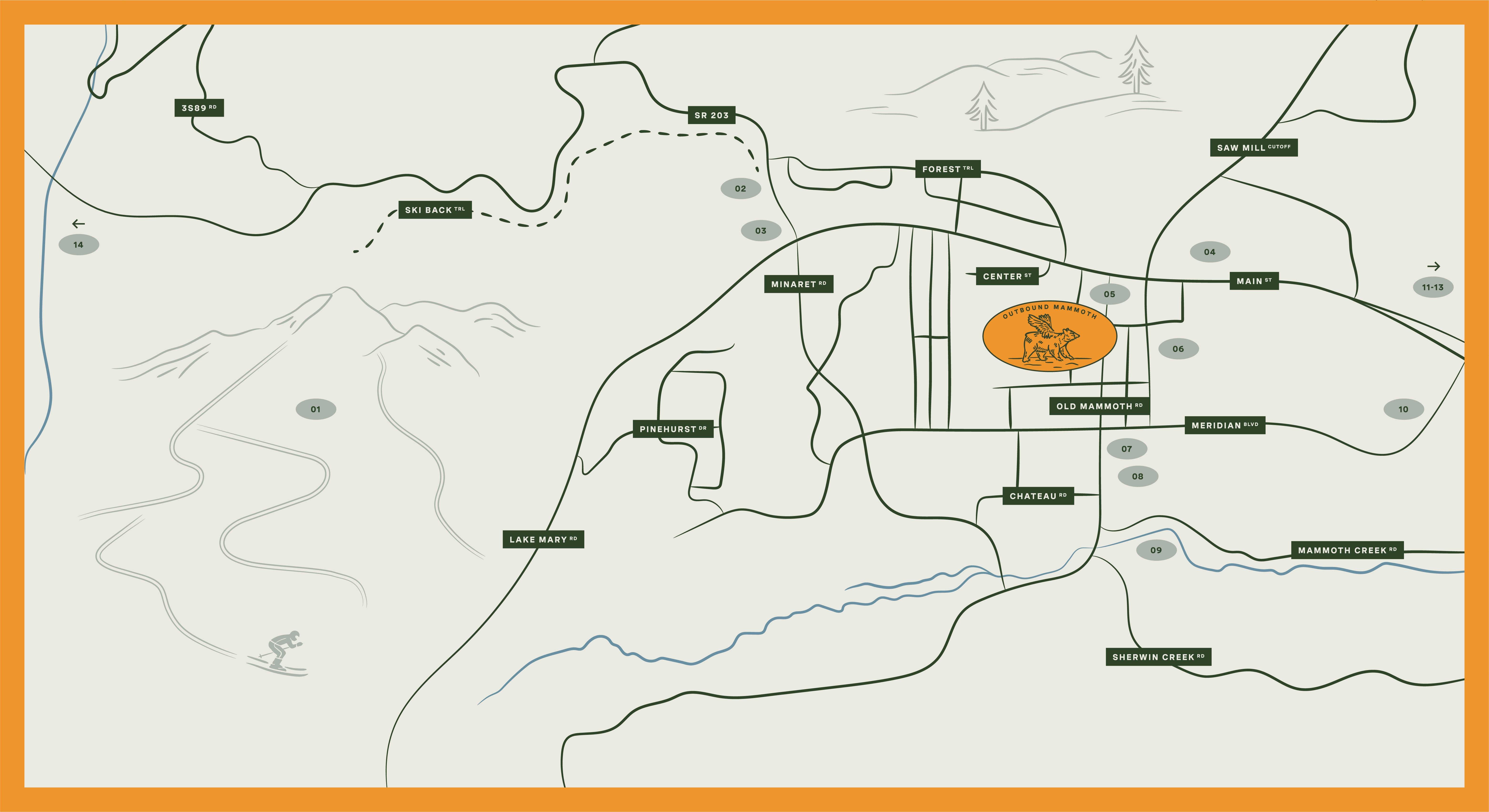
Outbound is all about connecting guests to the best of the location. We designed a system of area maps featuring staff picks and can’t miss spots.
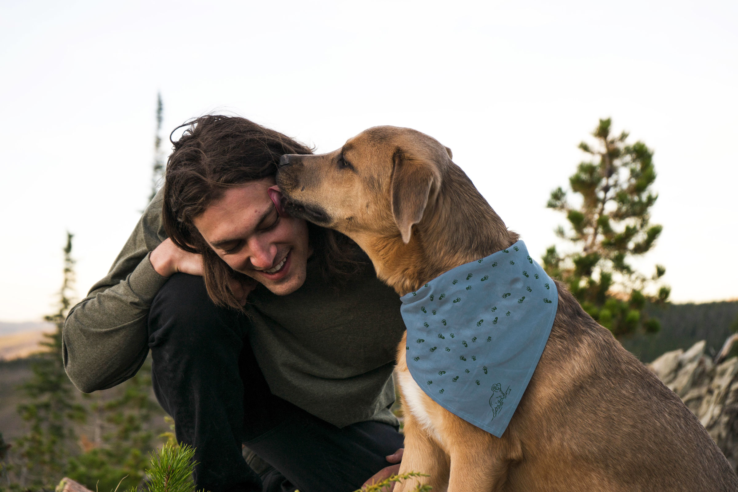
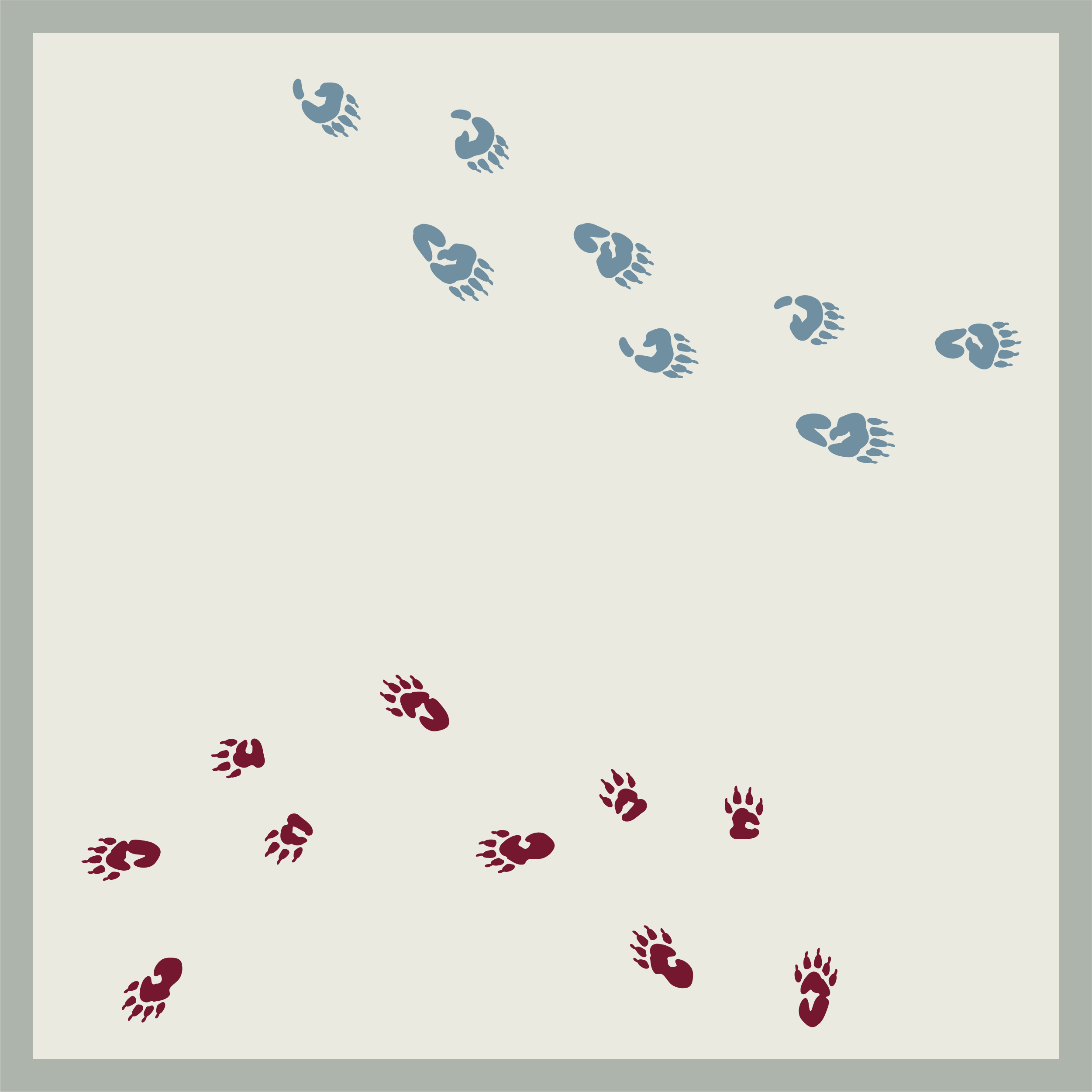
Outbound Hotels prides itself on being dog-friendly—and going the extra mile to make our furry friends feel special with upgrades like dog beds and custom merch. We created a pet-specific print using the tracks of each property’s unique mascot that can be applied to pet package items.

G&G Distilled is a curated, weeklong experience in the heart of Kentucky’s Bourbon Country. Participants gather together to celebrate America’s native spirit with rare tastings, intimate dinners, exclusive tours, and more. I worked with the team at Garden & Gun to establish the event’s identity, apply the visual system to collateral, and support multi-channel marketing through design of promotional materials.
( Many thanks to all who participated this year! )CREATIVE DIRECTION — Caroline O’Neill
COLLATERAL + EVENT DESIGN — G&G Marketing / Events
EVENT PHOTOGRAPHY — Shining Light Photography

The event experience was first introduced to the G&G readership through the run of a single magazine spread, with the goal of creating intrigue around the event details to follow.


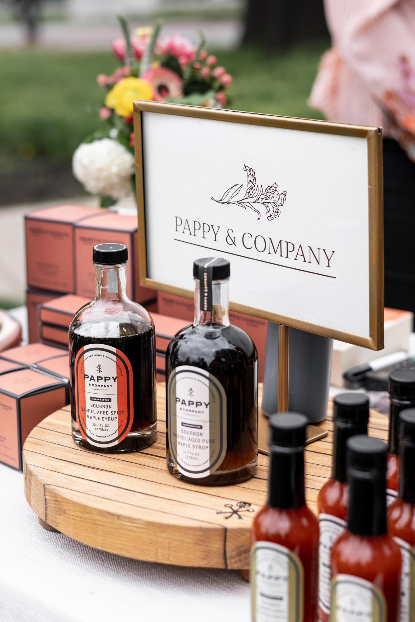
Our partners at Kentucky Tourism were looking to capture its beloved Bourbon Country with a fresh perspective. The identity pushes elegant typography and heritage-inspired illustration through bold application. A signature color pop, play with scale, and barrel shapes round out the system.


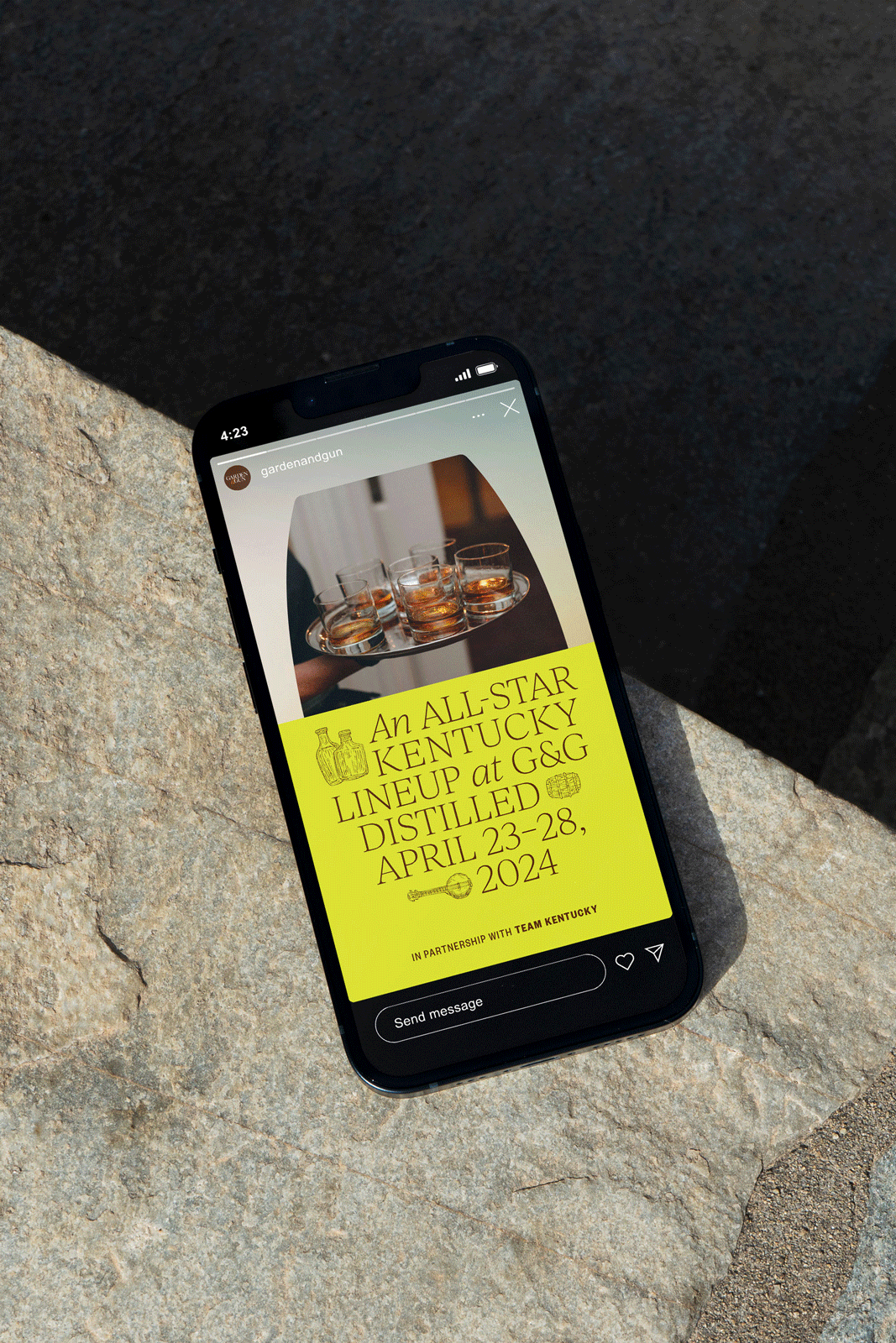
Leading up to the event, we flexed the design system to promote the experience (venues, musical guests, chefs, distilleries) across print, social, email, and web.
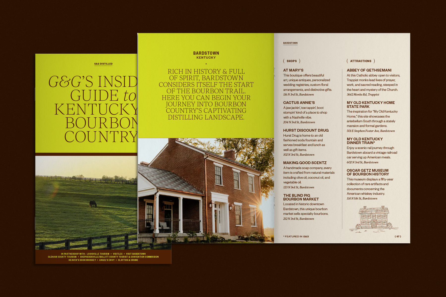
We produced a booklet of food & beverage, attraction, and shopping recommendations across all participating KY counties, provided to guests leading up to the events.
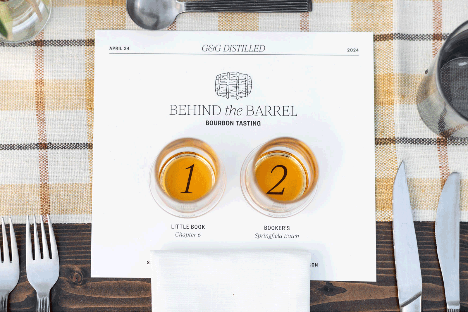

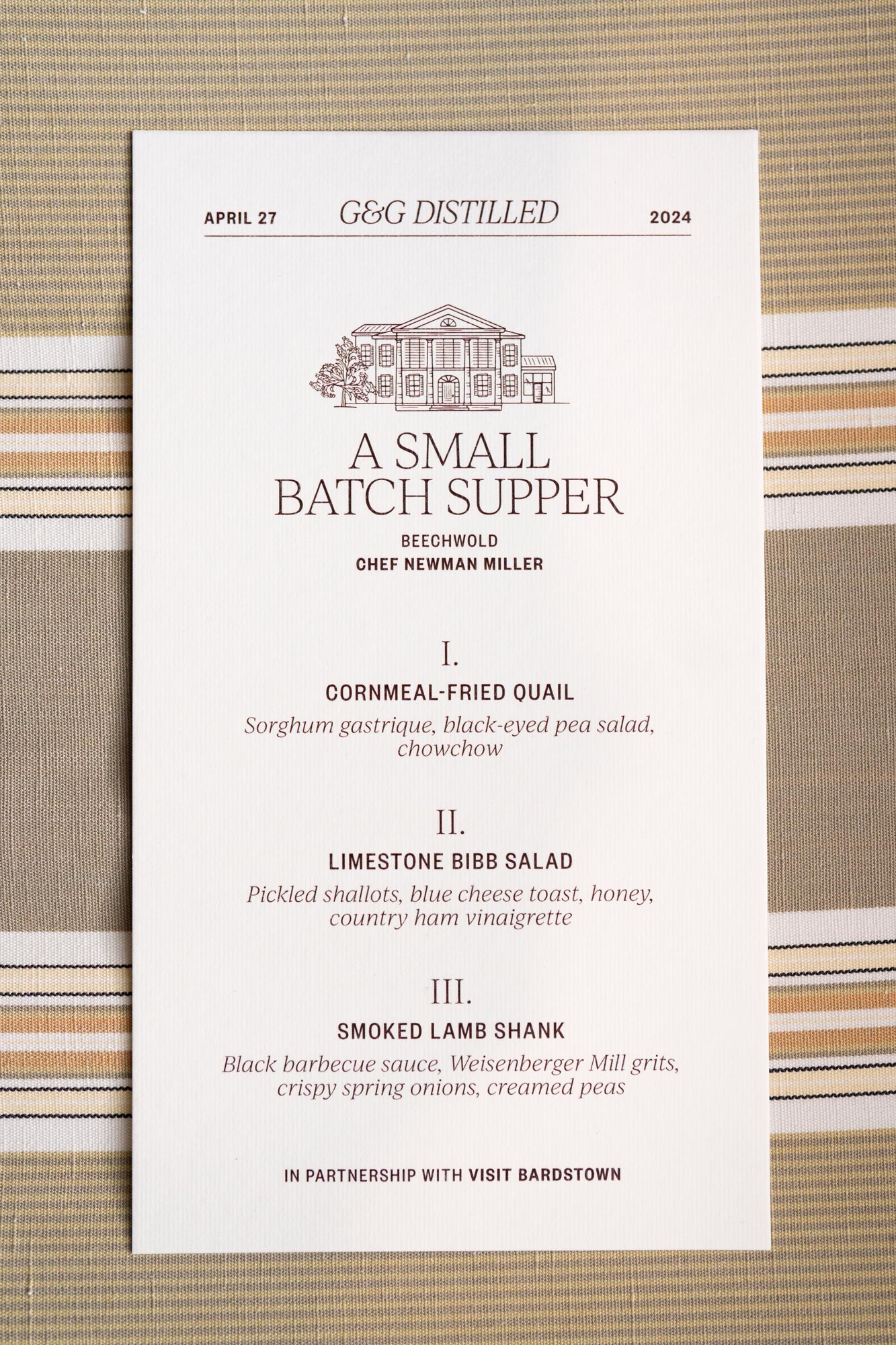
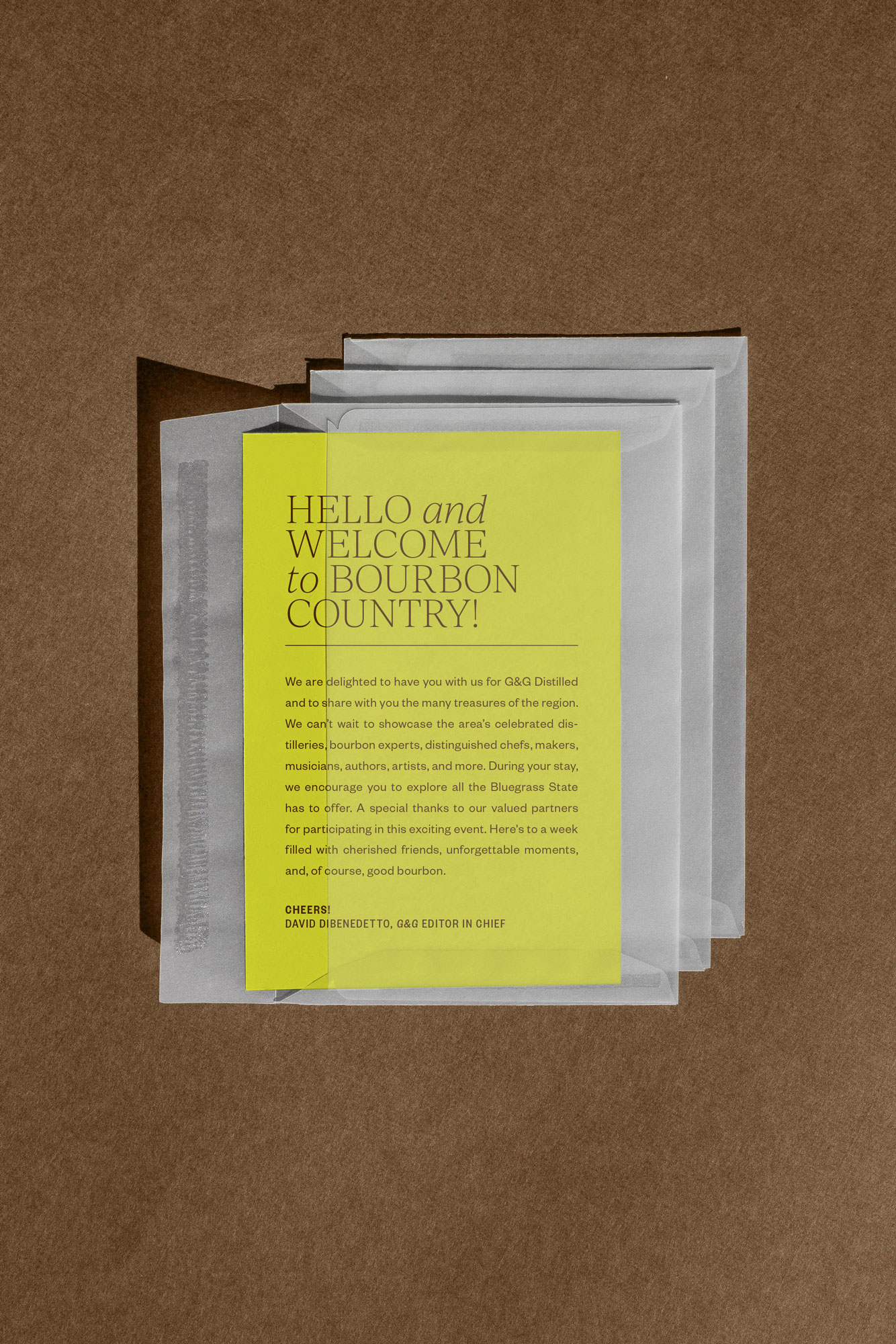

The design system was applied across a wide range of collateral, on-site at every G&G Distilled event.


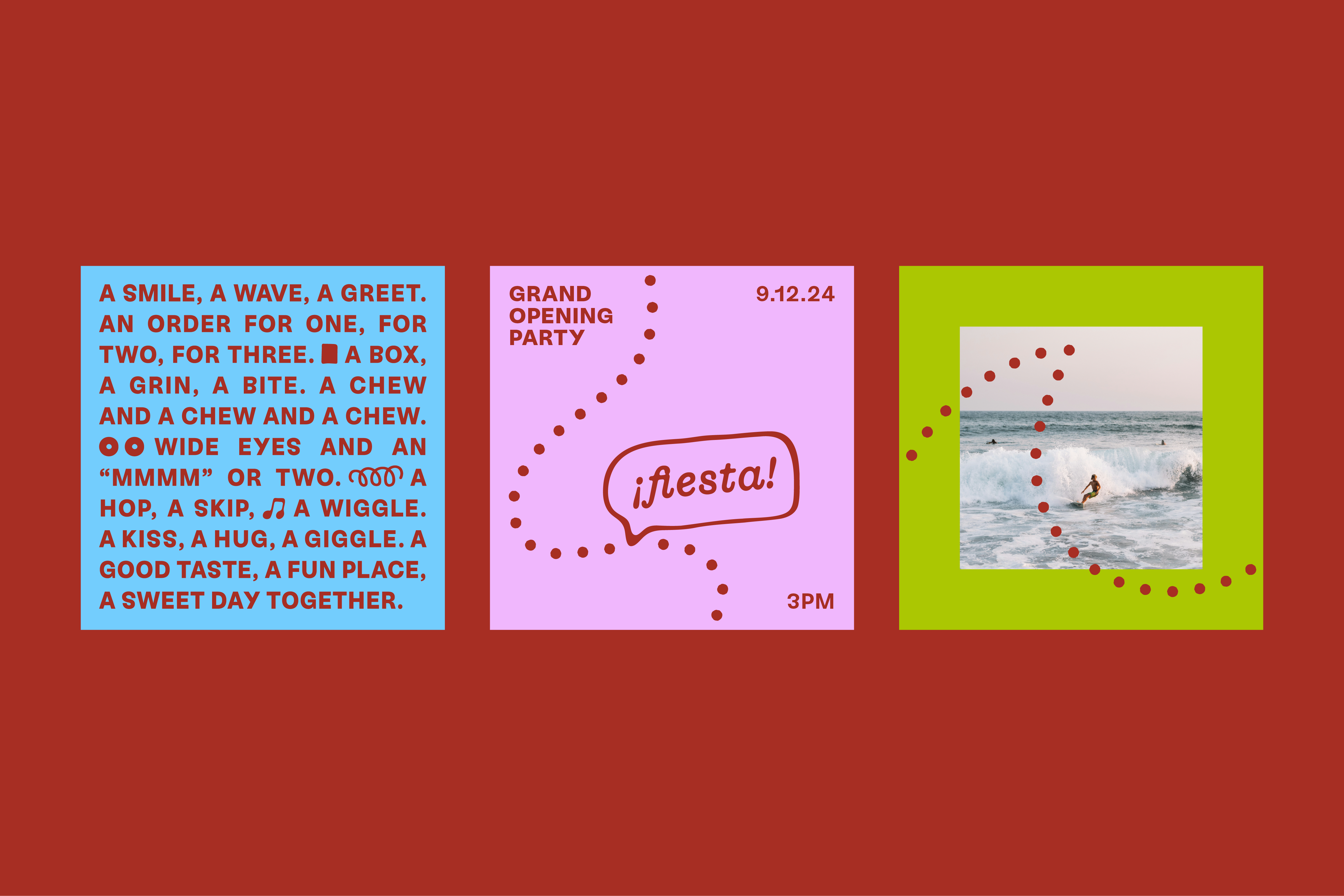
Flopi’s is a doughnut shop coming to the vibrant surf destination of El Tunco Beach, El Salvador. Freshly made cake doughnuts plus iced coffee and limeade will be served to tourists and locals alike in the heart of the beach town.
For husband and wife owners, Flopi’s began as a call to newness, an opportunity to experiment and take risks. Repurposing a playful childhood nickname and emulating a childlike spirit, Flopi’s nods to the past, wonders at the present, and looks to the future with hope and gratitude.
PARTNER / COLLABORATOR — Joshua Andrews
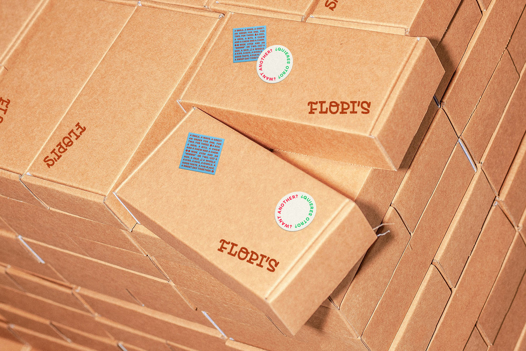
The story behind the Flopi’s identity system is very much inspired by the client’s values of curiosity, family, faith, and hospitality. Step by step, we follow a trail of crumbs set before us while leaving behind an impression of gratitude and joy. There are small moments and big ones; times of waiting, of activity. Twists and unexpected turns. Along the way, we’re affirmed in what we discover—and our eyes become more open to the sweetness in all of it.

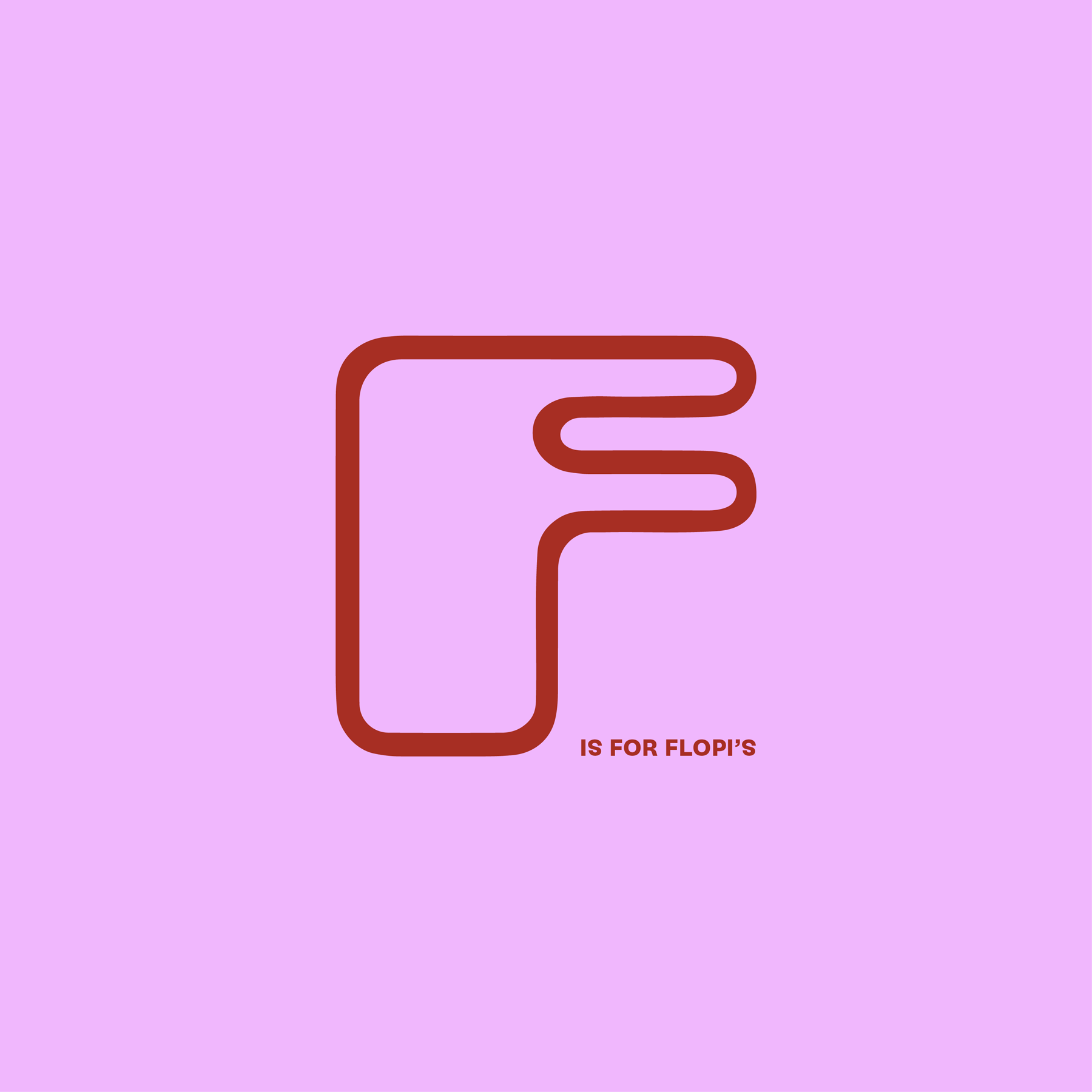
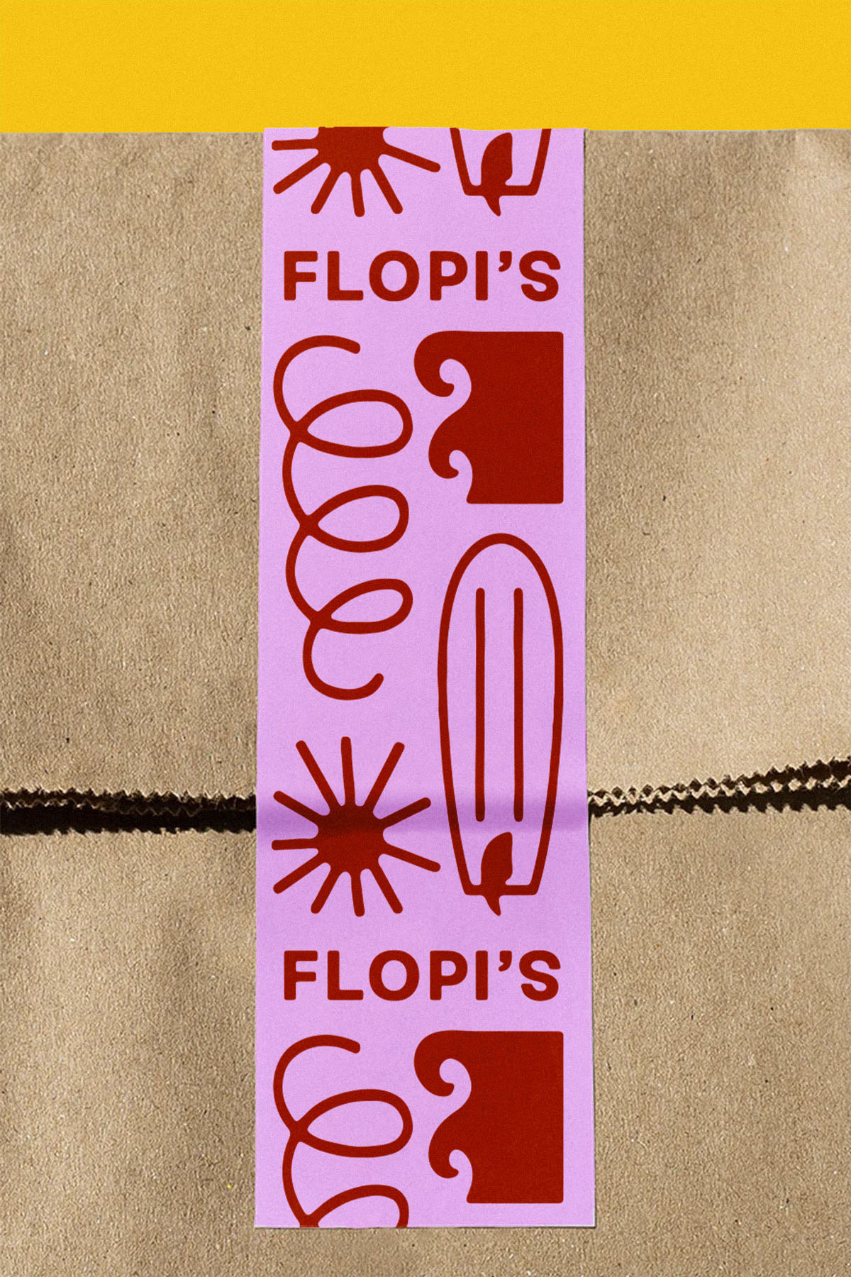
The identity system has a few signature design elements that bring the concept to life. The Flopi’s logotype has a playful, rhythmic presence featuring custom-drawn letterforms that stand with character.
To illustrate the idea of discovery and spark curiosity among guests, trails of doughtnut crumbs flow across surfaces of collateral, revealing illustrations and messages along the paths.
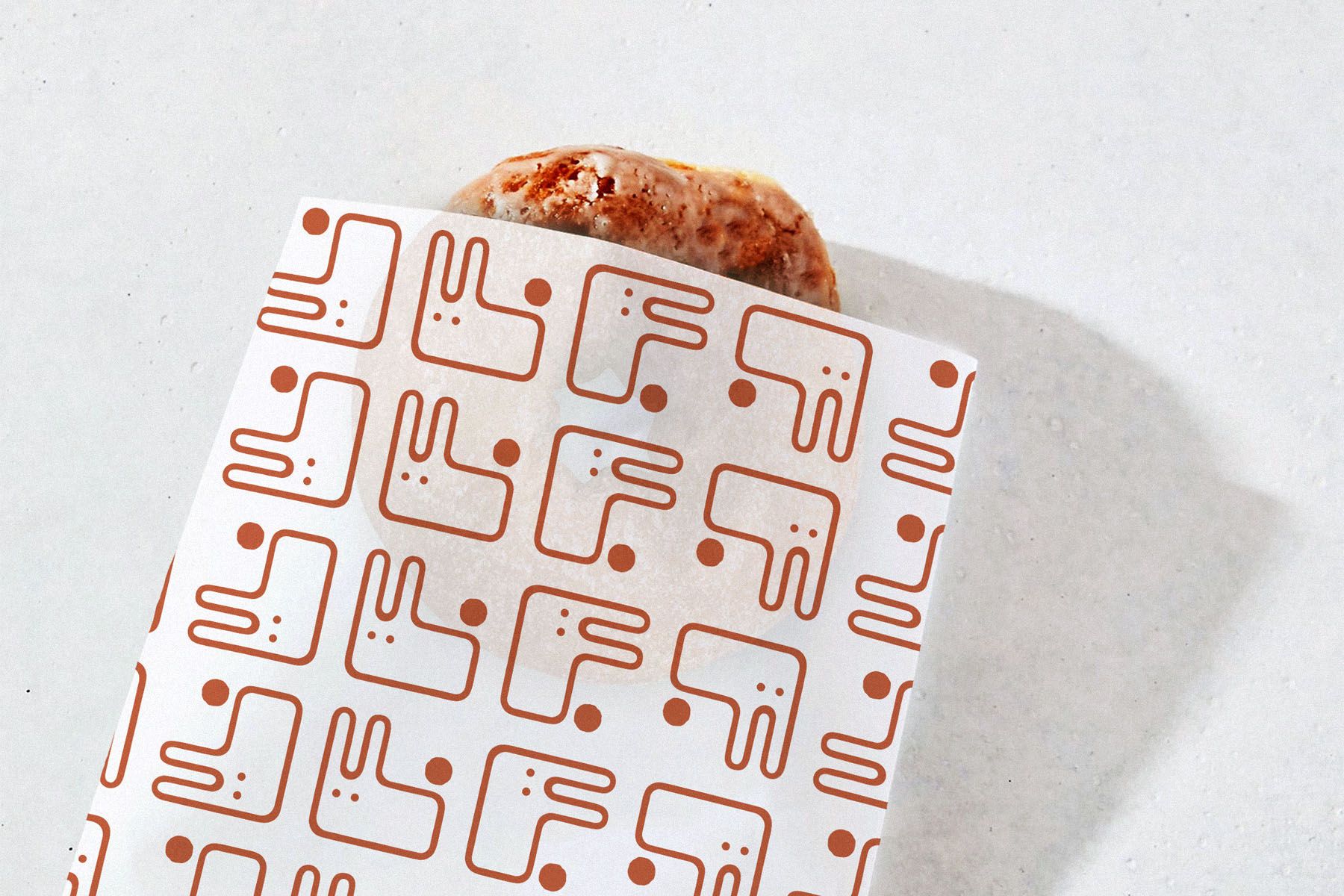
As a nod to the owner’s childhood, an “F” monogram is transformed into a fluffy bunny character.
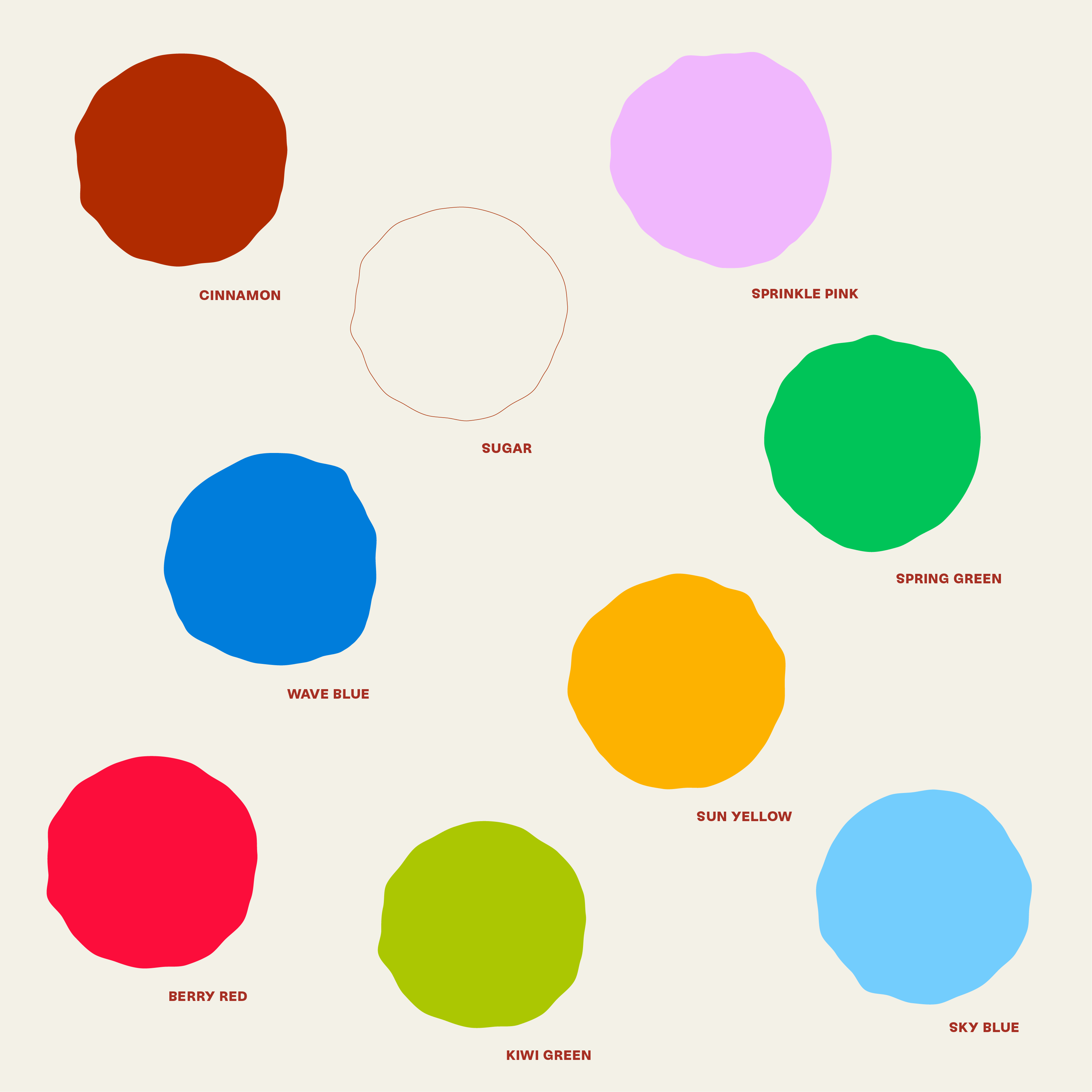
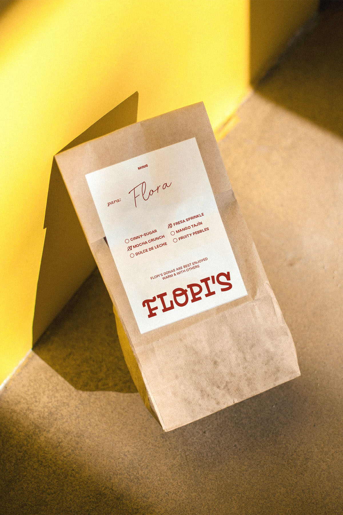
The Flopi’s color palette leads with notes of cinnamon and sugar, tying to the primary doughnut offering. Accent colors are bright and youthful, yet thoughfully applied to elevate the brand. For Flopi’s, it was important to create distinction through color.
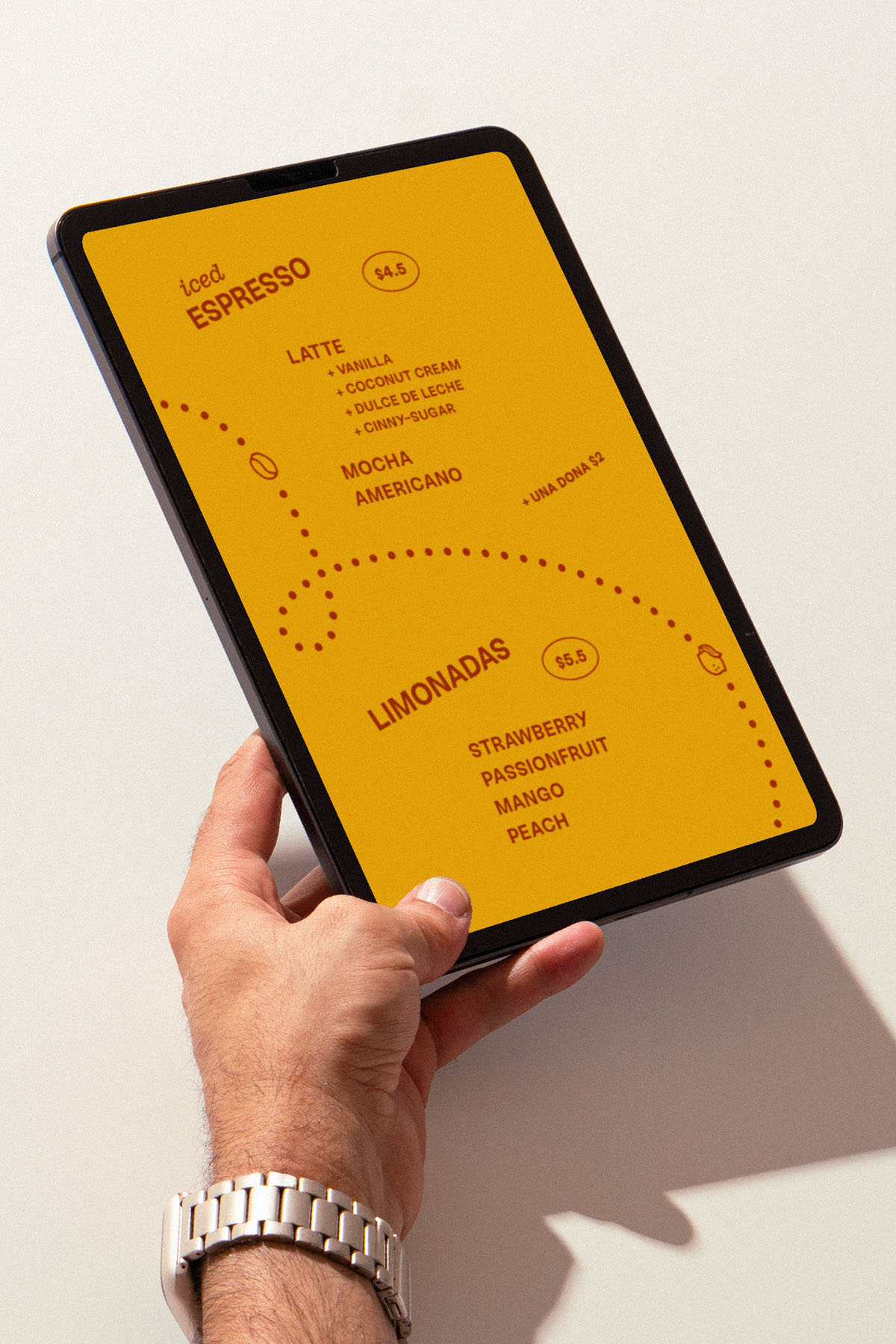
The type system uses a readable sans paired with a playful slab, set at angles and alternating alignments, conveying the twists and unexpected turns of the journey.

• ILLUSTRATION
The Flopi’s illustration style matches the tumbled quality of the logotype. Corners are rounded, edges are a little wobbly, and there’s some play with proportion. Illustrations are used along the crumb trails and within vignette-style lockups.

Hipcamp is an award-winning product through which users can discover and book unique camping, glamping, and outdoor experiences. I’ve been working with the in-house brand team to develop print and digital marketing creative to rollout new brand language, support lifecycle campaigns, introduce product launches, and evolve the Hipcamp brand.


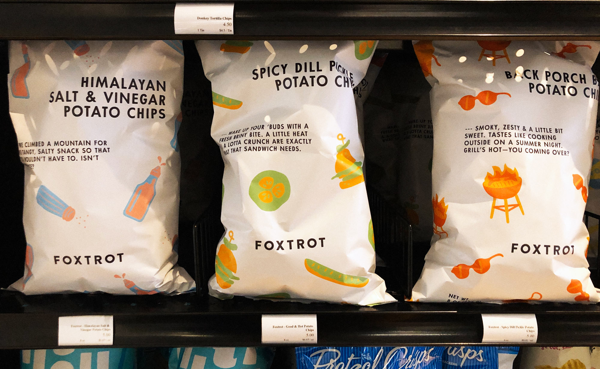
Foxtrot is a neighborhood market that offers specialty, curated goods—now including its own Private Label—at its locations around Chicago, Dallas, and D.C. “Everyday Joy” is the ethos that drives this product line and its packaging.
ROLE — Illustration, Design
PACKAGE DESIGN + COPYWRITING — Rex Runyeon
CREATIVE DIRECTION — Jeff Perky
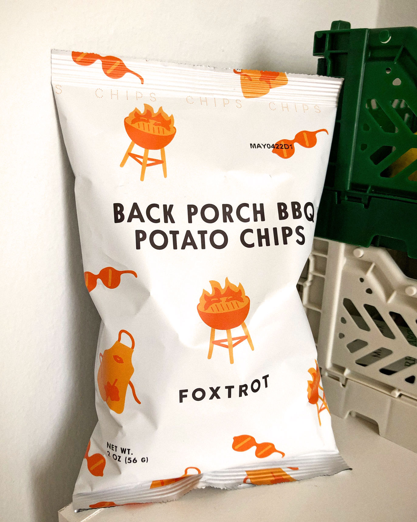
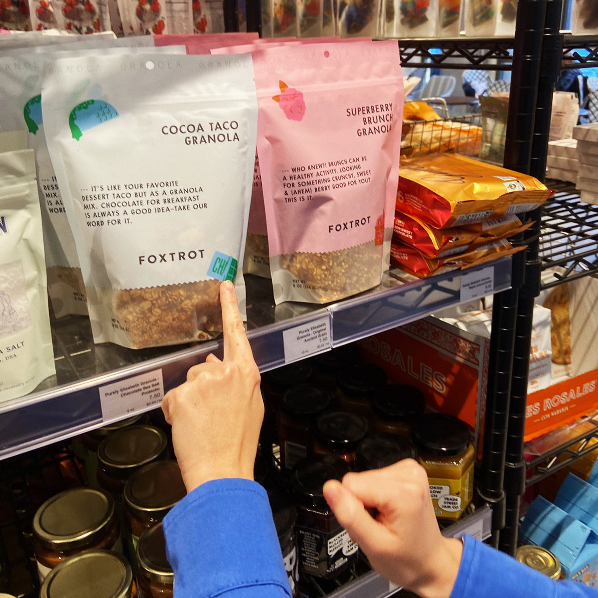
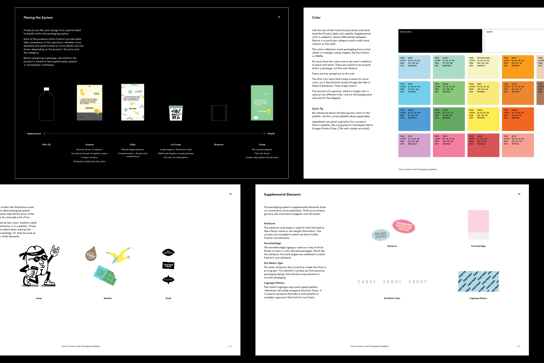
The Private Label packaging system is an extension of the Foxtrot identity built out by Perky Bros—layered, playful, nostalgia made new. Typography reflects a from-the-hand quality, as do the idiosyncratic, storied illustrations. My role included creating illustrations for chip and granola packaging, giving personality to each flavor, and applying the system across different package sizes.


Our team also worked to develop the Private Label Packaging Guidelines for Foxtrot, inclusive of inspiration and guiding principles to application of type, illustration, copy, and supplemental elements.